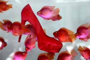
As I was speed walking up Madison Avenue the other day, this delightfully provocative shoe display at Barneys jumped out at me. Although Barneys adjacent display of 500 stilettos racing around a multi-level track, aka the “Barneys 500,” certainly caught my eye, it was this “Swimming with the Louboutins” display that really stole the show. It’s difficult not to notice highly sought after, sky high Christian Louboutin heels submerged in a tank of pink goldfish.
These displays play on pop culture references- the Indy 500 and a memorable quote from The Godfather, exemplifying Barneys traditional tag line, Taste, luxury, humor, (or wit, depending on your personal preference). One of the fashion world’s favorite styling strategies in the past few years has been employing a combination of high and low priced items into one ensemble. Perhaps Barneys is creating its own high-low ensemble by advertising a high priced product with what New York Magazine, publisher of a weekly approval matrix that discriminates between high brow versus low brow, would likely deem a low brow cultural reference?
Visit Barneys to view videos of these fantastic displays, or, better yet, visit in person.
Barneys: 660 Madison Avenue, New York, NY
Have any store windows or other forms of advertising caught your attention recently?
What are you feelings about these displays? Do you have any insight into the meaning behind the displays?
In your opinion, does using a “low brow” cultural reference to advertise a “high brow” product diminish the prestige of that product or does it make it even more desirable?
How relevant is the creativity and humor/wit of a product’s advertising to your decision to purchase a particular brand?


I appreciate something artistic – like the shoe in the tank of fish. I think that Barneys 500 reference may be lost on some – but the visual of the stilettos running around the track does enough on the surface, eye-catching level to still attract buyers. Wish I had seen it!! You’re lucky to have this near you!
I’d much prefer a display that is artistic, smart, visually enchanting or places me in another world (like positioning the product in a Parisian landscape). What irks me is that there are so many brands (probably all of them that I wear/own) that go too far when targeting women. A purse is a beautiful thing – but I don’t need to make love to it! Haha. So sometimes when they display all these objects with women who are in bed half-naked, it goes too far! When do you ever need a purse in bed?
I love low-brow/high brow pairings in outfits and enjoy seeing it done on well known figures who can afford all high-brow. It proves that style is about knowing what looks good together.